Each photo book you create will be home to a unique set of memories and elicit different emotions, so no two should use the same layout structure. It’s something that has to be found in the creation process.
Given this, we can’t tell you what layouts will perfectly showcase your memories. But we do have eight tips to help you discover them.
1. Determine how you’ll group your photos
Before you start, consider your photo book’s purpose and how you’ll group the images.
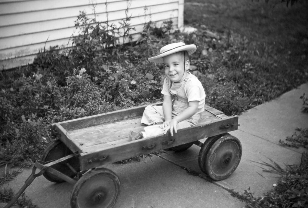
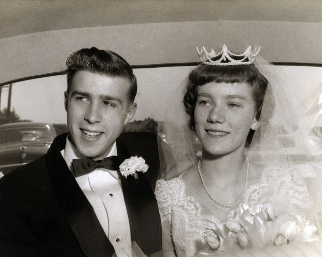
Say, for example, your photo book will chronicle a parent’s life. You’ll probably group them chronologically, starting with photos from their childhood, working toward your own childhood, and wrapping it up with their golden years.
Chronological order will be a natural fit for most photo books, but it’s not the only option. Your favorite vacation spots can be grouped geographically, while your holiday and seasonal memories may fit best thematically.
It’s a good idea to preplan your grouping scenario, but remember that creating a photo book is an artistic process. Be open to inspiration and innovation, too.
2. Choose an engaging lead image
As the name suggests, the lead image is your photo book’s first image. Because it serves as an introduction, it sets the tone for everything to follow.
If you want a fun, uplifting photo book, choose a lead image that exudes these qualities. Conversely, a photo book of abstract architecture could lead with an edifice that evokes a sense of curiosity and mystery.
Pick a photo with good details and eye-catching colors (unless you’re going with a black-and-white presentation). It should stand alone with no supporting images. Bonus points if it “leads” the viewer into the book with directional markers. For example, a photo of children running to the right generates a kinetic energy that entices a page turn.
3. Establish a focal point
Give each layout a focal point. The focal-point shot should be the best image in the grouping and tie all of them together thematically. To naturally draw the viewer’s eye make it the largest on the page.
Many people like their focal point in the center with supporting photos to provide context. For example: an outside shot of a beautiful museum paired with two smaller photos of friends enjoying the art within.
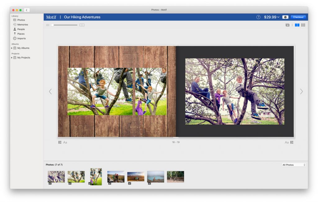
Feel free to experiment. Start with three supporting photos of your children climbing a tree on the left. Then put a large focal image of them sitting triumphantly on the tallest branch on the right. Here, the layout tells their story like a graphic novel.

4. Use bleed images effectively
What’s a bleed image? It’s when a picture “bleeds” to the edges of page with no borders or white space around it.
When selecting a bleed image, we recommend one with rich, small details worth marveling at. It should also fit your book’s dimensions. A landscape shot extends nicely across a 13x10-inch page, but may look odd on an 8x8 inch.
With Motif, you can use bleed images to create double-page spreads—that is, when an image extends across the gutter and onto the next page. When crafting a double-page layout, try a 60-40 split. Your focal photo should take up 60 percent of both pages. Use the remaining space for supporting images, but be wary of that gutter! You don’t want details like smiling faces to disappear between the pages.
5. Change up your layouts
The human eye craves novelty, so using same layout grows stale. A photo book of only bleed spreads overwhelms, while nine small photos per pages makes them less distinct.
Switch it up! Follow a single center image with a page featuring five images. Let the photo’s natural rhythm and your grouping strategy guide you.
Is there an exception to the rule? Always. There are times you may want to include a single center image on every page. A portfolio photo book, for example, should be used to show off your skills. You’ll want each image to speak for itself, so one photo per page makes sense.
6. Less can be more
Many photo books cram their layouts with photos. It comes from an understandable desire: to share as many memories as possible. Best to avoid this temptation, though.
Photo cramming prevents the photos from expressing themselves, making it difficult to truly appreciate the memories. Instead, choose the right photos and just enough to get across your point.
How many photos per page? That answer varies based on your desired outcome, and a lot will depend on the book’s dimensions. A 13x10-inch photo book gives you lots of room. You could reasonably include five or six photos and devise may layout options. Put those same six photos in an 8x8-inch book, and they have less room to breathe.
Is there an exception to this rule, too? Yes, and it’s called the collage layout. A collage collects a bounty of memories onto a single page. These overwhelm the visual field and makes creating a focal point difficult. In exchange, they have a strong emotional presence. We recommend using collages sparingly, either as a grand finale for your story or as a centerpiece that ties the theme together.
7. Edit your photos
Editing does more than make a ho-hum photo exceptional. It ties a page layout together.
You can crop a photo or rotate the frame to make it fit better. You can zoom in on a certain aspect of the image to make it stand out. You can even color correct to give supporting images a palette that matches the focal point.
8. Learning layouts with Motif
If you’re creating your first photo book, consider Motif’s Autoflow option. Autoflow uses advanced technology to curate your photos for you. It analyzes them for focus, clarity, image orientation, and even smiles. Then it groups the photos and lays them out in the photo book for optimal orientation. It will even crop, zoom, and center shots to help tie a layout together. Autoflow provides a professional-looking photo book in mere seconds. First timers can explore how Autoflow designed the photo book to get ideas for their next project.
Want a more hands-on approach? Motif comes preloaded with a panoply of professionally designed layouts to choose from. Simply select the layout you want and add your photos. From there, you can tweak things to your desire, or use Motif’s intuitive and user-friendly creation tools to craft the perfect layout from scratch.
With Motif, photo book designers of all levels can create the photo books of their dreams and have the innovative tools necessary to learn as they go.


