

Reading Time: 9 minutes read
In photography, color and light go hand in hand. The color of light in photos provides clues to viewers about the image. As the photographer, you experienced the moment the shutter button was pressed. The viewer only has the details and information within the frame created. Color affects the mood an image creates for the person seeing it.
Understanding the Mechanics of Color and Light
Color is a product of reflection. It is created through either a transparent medium or absorbed and reflected off a surface. Colors are the light wavelengths that the human eye receives and processes from a reflected source. When we see a color, we see the light of a particular section of the spectrum reflected.
Colors are impacted in photography by various factors, including the time of day, time of year, seasons, light, weather, and camera skills and equipment. A photographer needs to understand where colors come from and how they’re viewed. They should also comprehend how light can shape and shift color. Once mastered, looking through a camera lens is a new and rewarding experience.
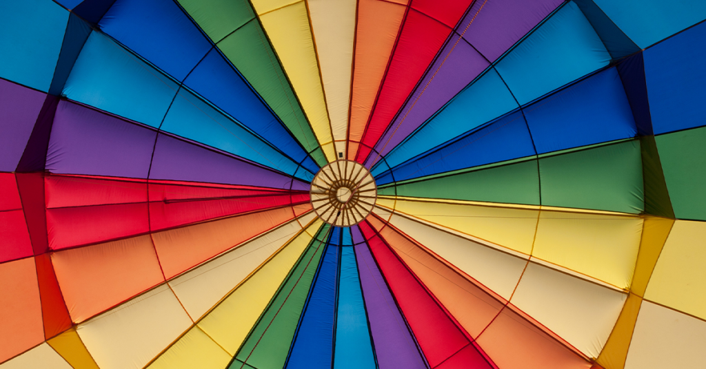
The Color Wheel
The color wheel was developed by Sir Isaac Newton in 1666. While studying white light reflecting off prisms, Newton noticed that the light reflected a spectrum of colors. He mapped these colors into the first color wheel and the original ROY G BIV color scheme. The 12 basic colors are called “hues.” Through these hues, Newton saw how a rainbow of colors shared a harmonious relationship. The 12 basic colors are broken down into three parts: primary, secondary, and tertiary colors.
Primary colors
Red, yellow, and blue are the three primary colors. These are the only colors that can’t be made by adding or mixing other colors together – they are “pure” colors. All other hues are created by combining these primary colors. Primary colors are used to grab the viewer’s eye. Without shading or tinting, these colors are very bright and vivid to the human eye.
Secondary colors
Green, orange, and purple are the three secondary colors. These colors are created by combining exactly half of two primary colors to make a new, second color:
Red + Blue = Purple
Red + Yellow = Orange
Blue + Yellow = Green
Each secondary color is directly opposite a primary color on the wheel. That relationship — opposite on the wheel — is called “complementary.” Human eyes notice the contrast between complementary colors more than other combinations.
Tertiary colors
Tertiary colors, also known as intermediate colors, are made by mixing either a 25/75 or 75/25 combination of primary and secondary colors. Sometimes they’re named after the two colors that created them. Sometimes they’re called by their own name. There are six tertiary colors:
Blue (primary) + Purple (secondary) = Blue-Purple or Violet
Red (primary) + Purple (secondary) = Red-Purple or Magenta
Red (primary) + Orange (secondary) = Red-Orange or Vermilion
Yellow (primary) + Orange (secondary) = Yellow-Orange or Amber
Yellow (primary) + Green (secondary) = Yellow-Green or Chartreuse
Blue (primary) + Green (secondary) = Blue-Green or Teal
Color Variables
The three basic components, or variables, of color are hue, value, and saturation. These are all important to create photographs with accurate harmony and balance.
Hue
Hue is what people think of when using the term ‘color.’ It corresponds to its position in the color spectrum. In scientific terms, hue describes the wavelength of a color. Human eyes can only process a tiny region of the electromagnetic spectrum, which is visible light. Part of the electromagnetic spectrum is measured in nanometers (nm), and the colors a human eye can see fall between 400-700nm. Violet and blue light have the shortest wavelengths and scatter a lot easier in comparison with red, which has the longest (visible) wavelength of 635-700nm.
The length of wavelengths will change what color is seen by the eye. The sky is blue because blue wavelengths of light are scattered through the atmosphere. If green had the shortest wavelength, the sky would be green. Each hue contains the entire array of wavelengths found in visible light, but one will be more dominant than the others which creates a distinct hue. So, a hue is actually the base color, determined by its wavelength.
Value
Value is the relative lightness or darkness of a color. This is what’s seen in a black and white photograph. Adding white to a color makes it lighter, which creates “tints”. Adding black makes colors darker and creates what’s called “shades”.
Saturation
Saturation highlights the brilliance and intensity of a color. The saturation of a color is its degree of richness, intensity, or purity. Other commonly used terms for saturation are intensity or chroma.
Saturation is measured in percentages. A hue will be the most vivid at 100% saturation. The intensity of a hue is decreased by adding gray or the complementary color. Taking red and adding cyan to it (red’s complementary color), the grayer the red will become. If equal parts of red and cyan are mixed, the result will only be grey.
Luminance
Luminance is the intensity of light emitted from any color in a photo. It’s a measurement to describe the perceived brightness of a color. Luminance is also used in photo editing to blend brightness and change the feeling of an image.
Color Harmony
In photography, color harmony combines colors to create an appealing, effective photograph. These “harmonies” are established combinations based on their position on the color wheel to create a satisfying balance of colors that are pleasing to the eye.
Complementary colors
Complementary colors are shades that are located directly across from each other on the color wheel. Examples of complementary colors are blue and yellow, or orange and green. These colors are “complementary” because they work well together, meaning they can create a high-contrast and vibrant look, especially when used at full saturation. Use complementary colors in photography to draw attention to a focal point or express bold colors that stand out.
Analogous colors
Analogous colors are three colors that are side by side on the color wheel. They are composed of one dominant color (usually a primary or secondary color), a supporting color (a secondary or tertiary color), and a third color that is either a mix of the two first colors or an accent color that pops.
Without the strong contrast of complementary colors, analogous colors are calming to the eye. A great place to try analogous color schemes in photography is landscape and nature photography. There it can reveal subtle differences in tones and hue with foliage, animals, or flowers.
Monochromatic colors
Variations of one color create monochromatic colors. Any color can be used to create a monochromatic color scheme. For example, adding white to red makes pink. Adding black to red creates maroon. This creates a monochromatic color scheme of pink, red, and maroon.
Use monochromatic colors to create a calm and serene design. It is used to simplify a photo with black and white photography. When visual distraction is removed, there’s a greater degree of concentration on composition or texture.
Color Theory in Shooting vs. Photo Editing
There are no limits to testing boundaries of color and light in photographs. Pick a favorite color and take photographs that include it. Fill the frame with two or three hues in an abstract composition. Photograph color in an unexpected location for visual interest. A red umbrella against a white wall. Or photograph the same color in different settings and themes such as in nature, architecture, landscape, urban, and portrait.
Photo editing software such as Adobe Lightroom, Apple Photos, or any other RAW editor tests new and exciting ways to adjust your compositions’ colors. Here are some aspects of color to use while editing to make the best of your photos:
Color Contrast
When editing a photo’s color contrast, the goal is to either increase contrast and make an image more dramatic, or decrease it to make an image softer. Editing software features filters that include specific sliders to adjust color contrast. Experiment with photographs with various colors, such as a landscape of colorful homes or during fall foliage season.
White Balance
White balance is the adjustment of a digital photograph to make colors appear more realistic. It’s a way to set a picture to neutral, or to make the white look white. For example, a photo of snow in bright light can appear bluer than it is. To counteract this, use post-production software to eliminate the blue cast. While the iPhone camera app does have some automatic settings, for truly getting accurate white balance, programs such as Adobe Lightroom, Photoshop, and similar photo editing programs provide more control.
Muted Colors
Muted colors work best as soft and calming tones. They give off a natural feeling that plays well with portraits, landscapes, and still life. Use muted colors in editing to provide photos with vintage looks, sepia tones, or more black and white saturation.
Neutral Colors
Neutral colors are earth-tones related to natural elements of an outdoor environment. Neutral tones are the color of sand, water, or fog, for example. These tones often range on the warmer scale and are opposite to bold colors associated with dramatic tonal differences. Photograph warm yellows and oranges and lower the saturation to create a natural image that aligns with the neutral feel.
Colors are an amazing part of science that shapes every part of life. It affects what people wear, how homes are decorated, and how cities are viewed through people’s unique eyes. Color is powerful. It makes images stand out and wow a viewer. Color theory is one of many photography terms to jumpstart your photography education to make you a wide-eyed and well-informed photographer.
Bring Your Photos to Life With a Personalized Photo Book
Once you’ve finished editing your photos, create a beautiful memory book with Motif. Whether it’s your latest holiday photos, candid everyday shots, or a family photo album for relatives, creating a personalized photo book is easy with Motif.
There are over 80 personalized layouts and various backgrounds and sizes to fit your needs. Photo books are the perfect way to celebrate and share your favorite photographs with family and friends. Download the app today and give your stories a home with Motif.


